PortSight~8 min read
A freight tool that hands you the next move.
Four A-versus-B calls that only added up to a thesis afterwards, in a logistics prototype I built alone.
- Role: Research, product strategy, design, front-end
- Timeline: Side project
- Team: Solo
- Impact: Not measured yet
- Platform: Web
The short version
In freight operations, missing a customs filing is priced rather than inconvenient. A team learns on a Tuesday that a filing is overdue, a port is closed, and a carbon declaration is short by 170 tonnes, each with its own deadline and its own fine. The systems that track all of it are good at surfacing everything and silent on which one costs the most if you deal with it after lunch.
I built PortSight alone, design through front-end. The first version monitored beautifully, which is what tools in this category tend to do, and you could study it for a minute without knowing what to do next.
The work came down to four decisions, one per surface, and each was the same question. Show the situation, or hand someone the next move. I made them separately, then read the log back and found I had been answering the same question all along.
Scope
I owned
- Research with five shipping operations managers over a week, covering both whether the problem was real and how the four pairs of directions performed
- Product strategy and the thesis, which arrived after the decisions rather than before them
- Four A-versus-B direction calls, one per surface, each logged with what was rejected and why
- The design system: tokens, seven shared components, severity tiers, motion timings
- Front-end implementation in React and TypeScript: no engineer on this
- The accessibility and status-indicator pass, and the drift backlog naming what’s still wrong
The problem
What good is a tool that tells you everything except what to do?
A shipment is late, a filing is overdue, a port is closed. The systems that track this are good at surfacing all of it and they leave the hardest part on the desk: of the nine things currently wrong, which one costs the most if you deal with it after lunch?
That’s not a data problem. Everything needed to answer it is already on the screen: the deadline, the fine, the route, the owner. It’s an arrangement problem, and arrangement is the part nobody treats as a decision.
Port operations
Vessel arrivals, berth assignment, and the question of which disruption to work first.
Compliance and regulatory affairs
Filings against statutory deadlines, where being late is priced rather than inconvenient.
Finance
Exposure across the portfolio, and what any of it means before a board meeting.
I built two directions per surface, far enough to be wrong in public.
Four surfaces, and for each one an A and a B taken to working prototype rather than to a comparison table. Over a week I put them in front of five shipping operations managers, first to find out whether the problem was worth solving at all and then to watch them work with both versions of each surface. Then a decision, written down with the rejected option and the reason next to it, so a call made in April can still be argued with in June.
What follows is that log. Three of the four rejections are things I had already built and liked.
The decisions log
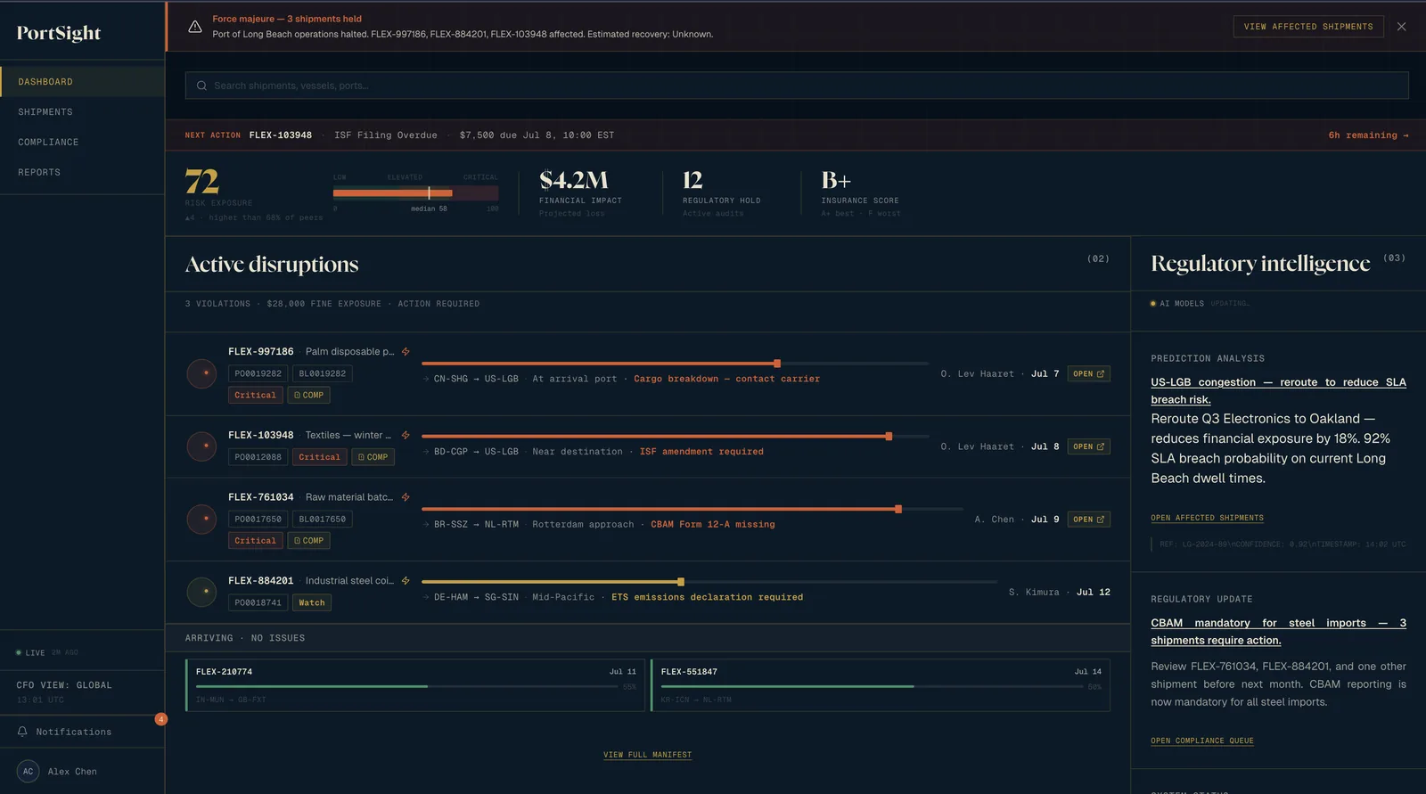
Cockpit or queue?
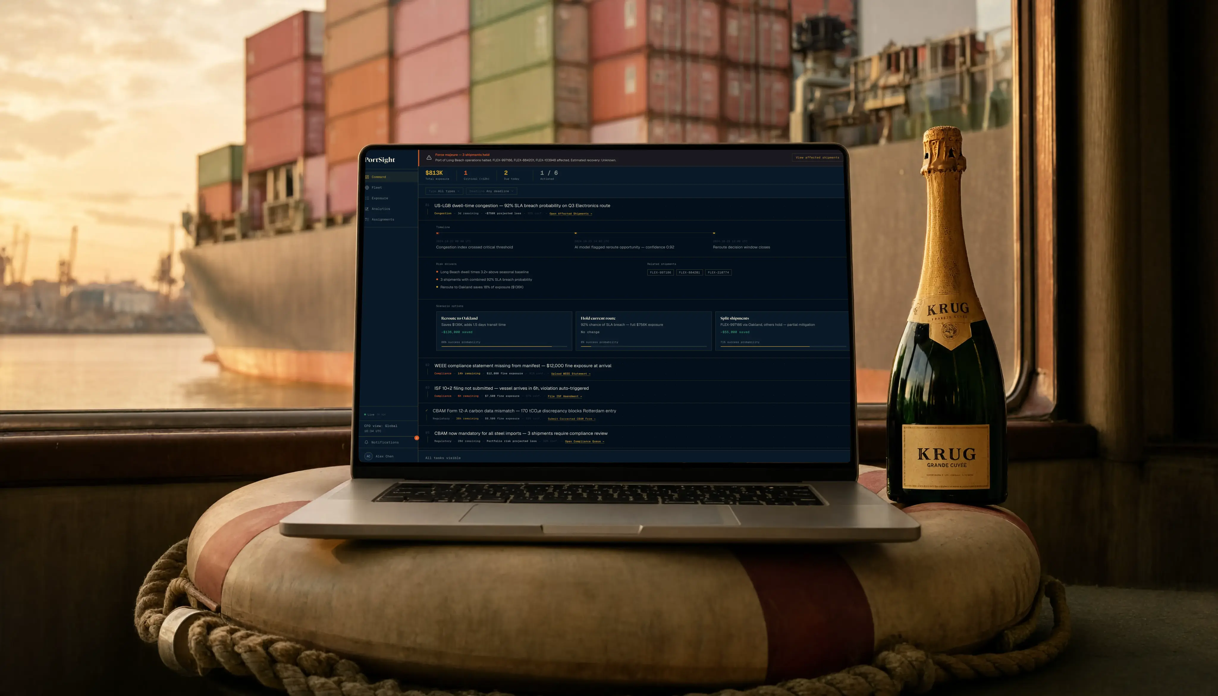
I chose a ranked decision queue with one row per item over a system-health cockpit showing risk index, active disruptions, and regulatory intelligence side by side. The cockpit couldn’t immediately tell a user what to do now, and it needed opinionated, data-rich panels the prototype lacked the fidelity to support.
A queue makes a strong claim about priority, and getting its first item wrong makes the product confidently wrong rather than merely unhelpful. So each row shows confidence beside exposure, and filters let users re-cut the queue by type or deadline. Three of the five favoured the queue’s ordering outright — a read from five people, not an instrumented result.
Was the map helping anyone?
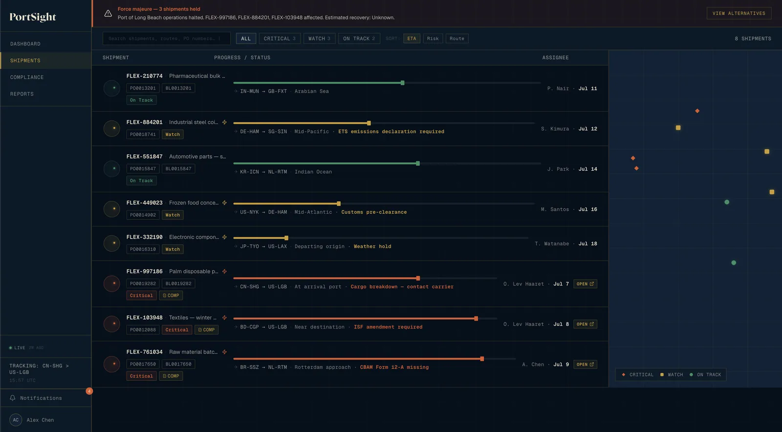
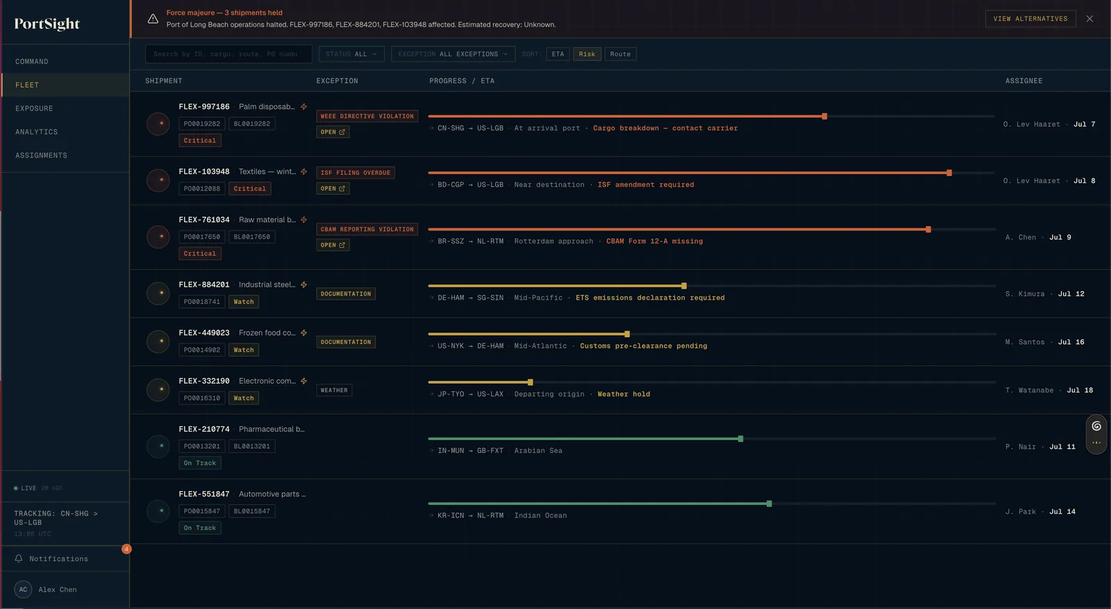
I removed the map and rebuilt the list around exceptions, rather than rebuilding a map on real AIS data. The existing one used hardcoded CSS percentages, had no connection to the vessel-tracking feed, and occupied a third of the screen without operational value over the list. A real map needs a live feed, coordinate rendering, and clustering; shipping the fake one would make the prototype lie to its author.
It is also the screenshot you put in a portfolio, and it took real work to build — which is why it was the hardest to give up. But an operations manager doesn’t need to know a vessel is somewhere in the Indian Ocean; they need to know the import security filing on it expires in six hours. Two of the five said as much unprompted: a map gives position rather than priority. The rebuilt list carries exception type, for which the map version had no room.
What happens when there are twenty holds, not one?
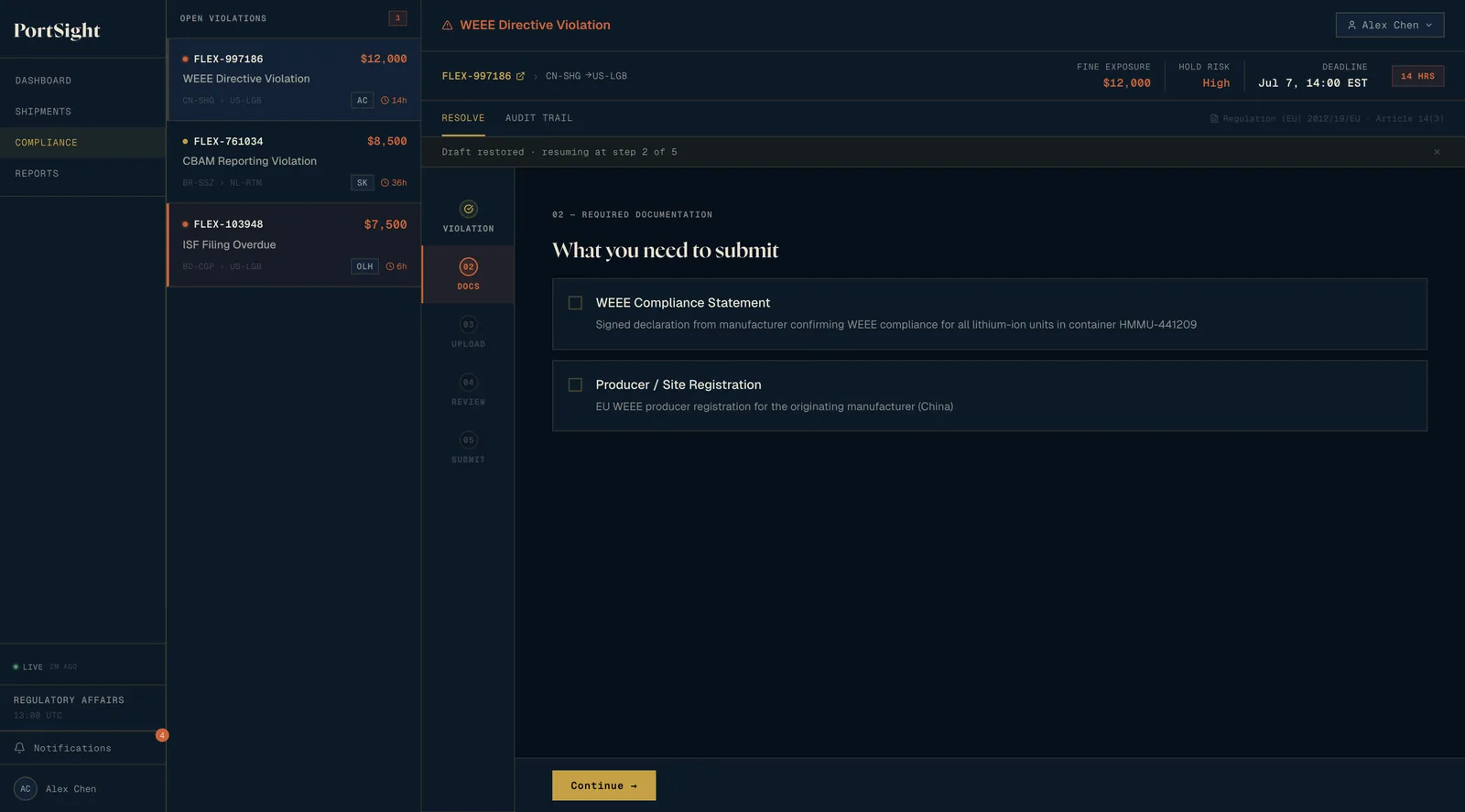
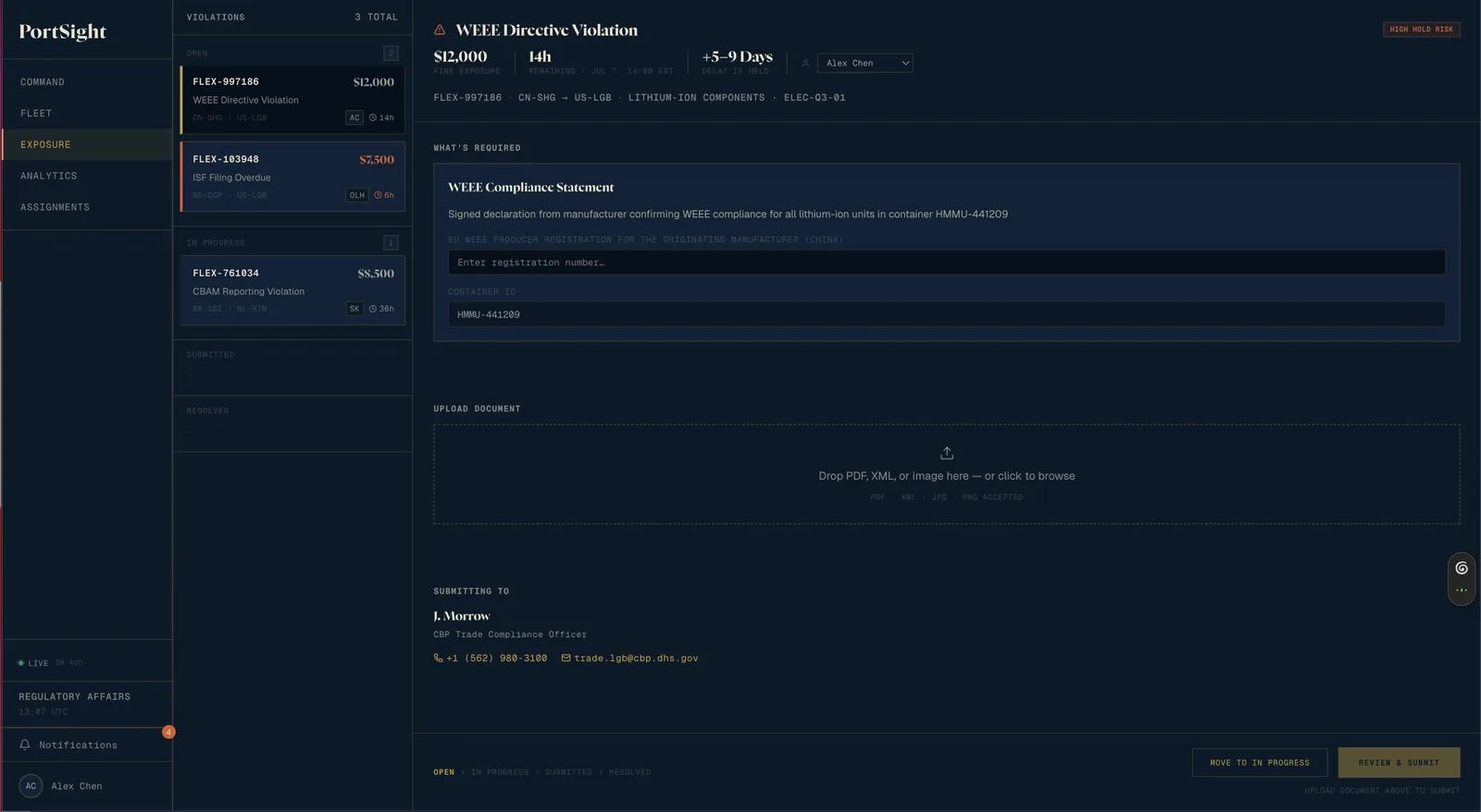
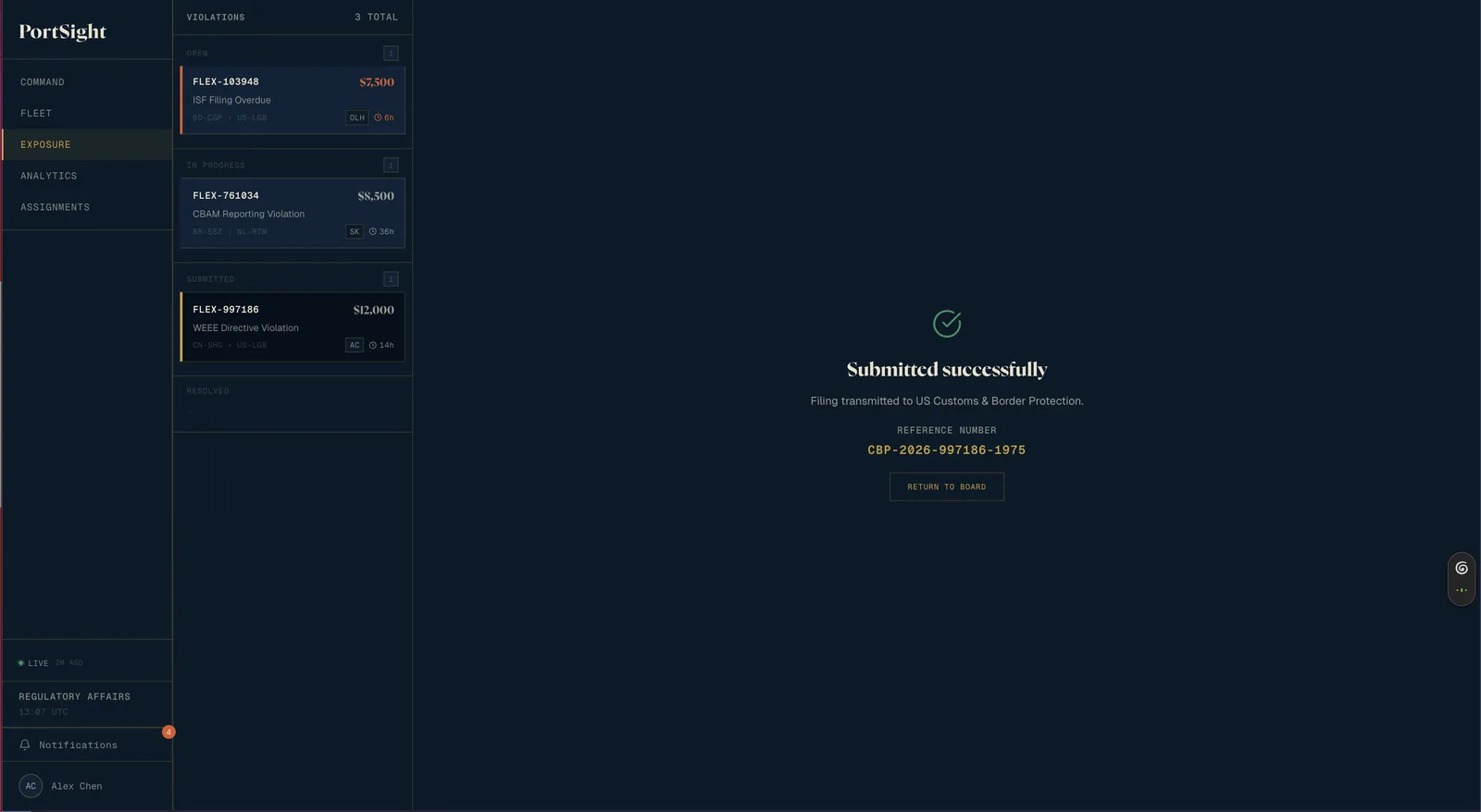
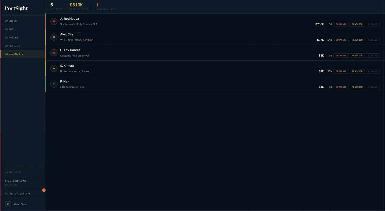
I chose a triage board with Open, In Progress, Submitted, and Resolved states plus a single-screen action view per violation, instead of a five-step wizard with a fast track for simple violations. UFLPA-style enforcement creates five to twenty simultaneous compliance holds, and the wizard makes each one travel through five screens.
The board risks losing the wizard’s review step, and an incomplete filing is worse than a late one because a customs officer rejects it while the clock continues — so the confirmation sheet retains the full review: required fields, uploaded document, receiving authority contact. The same two rejected the wizard on the same grounds: five screens per violation hides the other nineteen.
Do reports need more charts or a point of view?
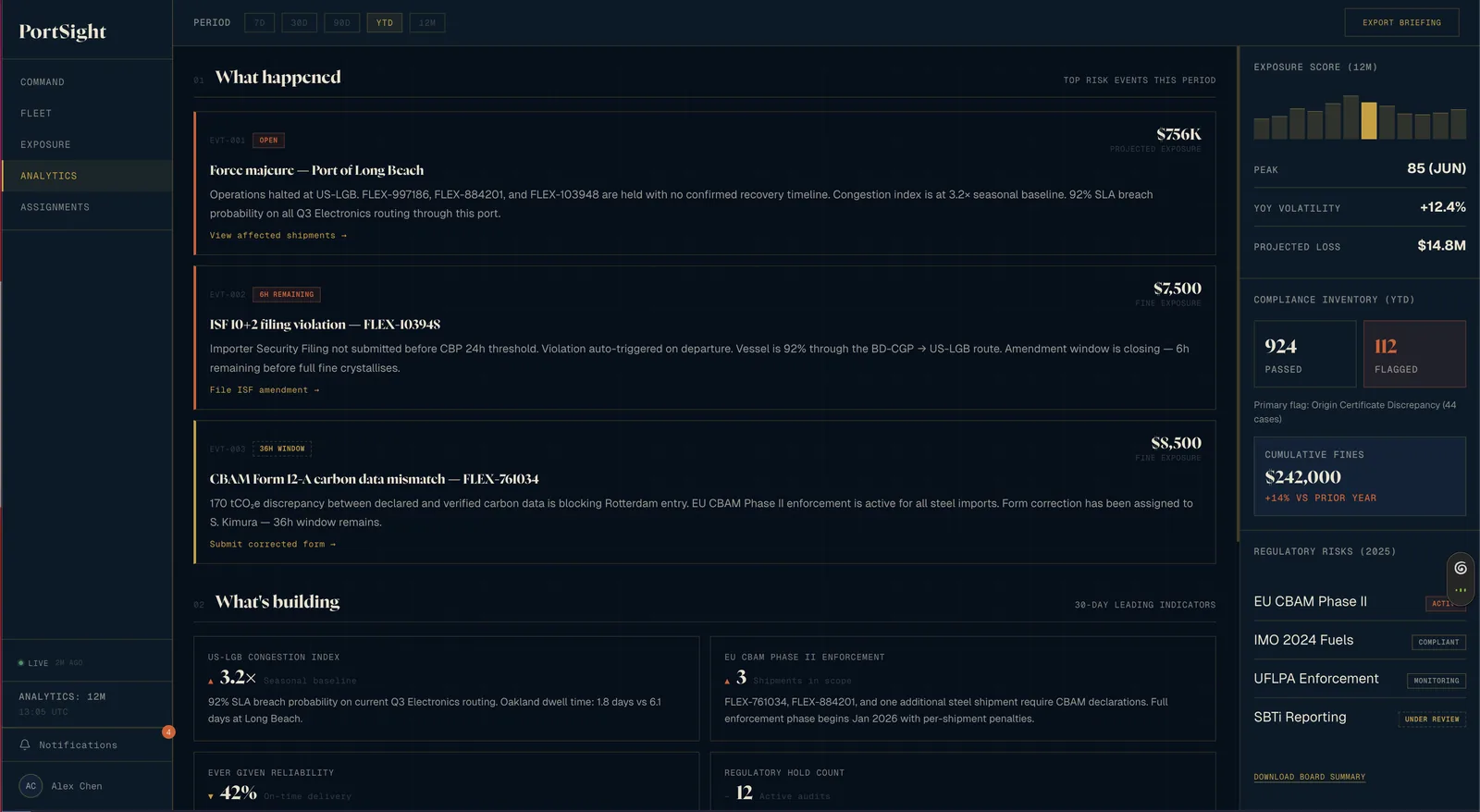
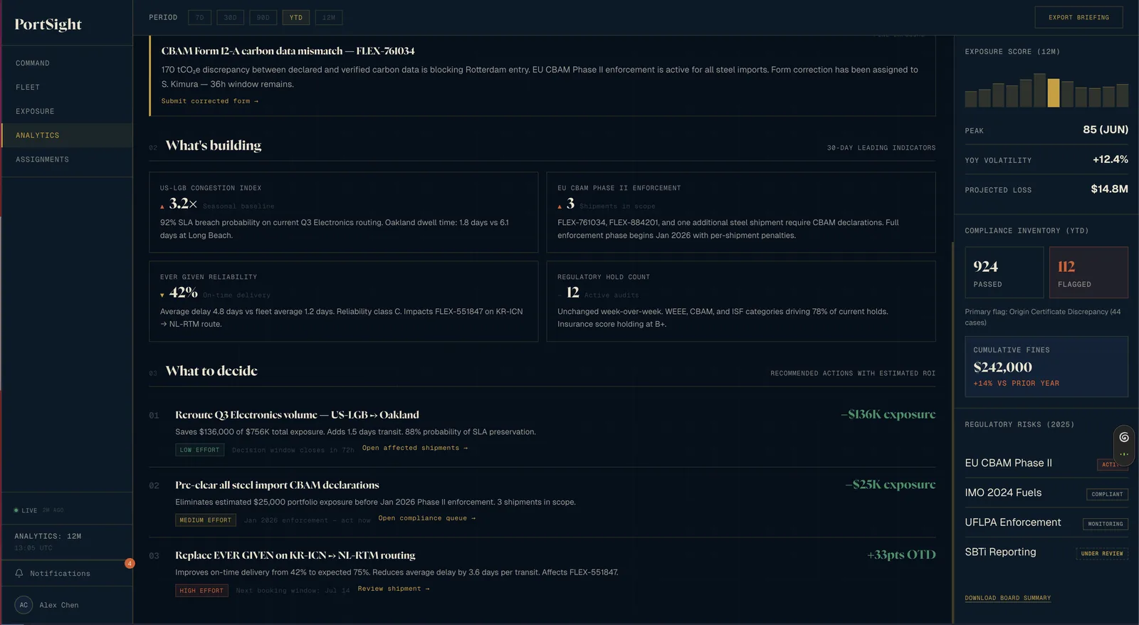
I chose a three-part narrative intelligence briefing with charts in a supporting sidebar over a fixed analytics grid with working filters and real exports. CFOs and risk officers open Reports to decide, and a $14.8M projected loss without its implication isn’t useful.
That editorial position can be wrong in a way someone can point to, so each recommendation carries its arithmetic: “saves $136,000 of $756K total exposure, adds 1.5 days transit, 88% probability of SLA preservation.” Readers can reject the recommendation and keep the calculation. Working filters and real exports remain prerequisites built under the briefing format, not instead of it.
The thesis, arrived at backwards
PortSight is a decision-support tool. Monitoring is the thing it stopped doing.
That sentence is in the decisions log, and it is written after the four entries above it rather than before them. I did not start with a thesis and apply it four times. I made four separate calls about four unrelated screens, wrote down why each went the way it did, and then read the log back and found I had been answering the same question all along. Which is an argument for keeping the log: the pattern wasn’t visible from inside any single decision.
The sessions said the same thing in the operators’ own words, and they said it about the two surfaces I had found hardest to give up. Everything at once, and a clear account of what demands attention now. The map failed the second half and the wizard failed the first.
One question per screen
- Command: what do I act on right now, and in what order?
- Fleet, which shipments are off-plan, and why?
- Exposure: what violations need resolution, and which can I batch?
- Analytics: what does our risk exposure mean, and what should we do about it?
The rejected directions aren’t wrong. A cockpit, a real map, a wizard, an analytics grid, each is the right next layer once the decision layer underneath is proven, and each needs data fidelity this prototype doesn’t have. Build the decision layer first, then add awareness on top of it. That ordering is the product plan.
Building it alone
No engineer on this, so the design system had to be code that actually runs. Shared style values in code, seven shared components, three severity tiers, motion timings with entrance and exit easing separated. The discipline matters on a solo project because the design decisions have to survive me implementing them at eleven at night.
The system doc carries a Known Drift section listing what’s still wrong: off-grid spacing at 7px, 10px, and 14px, and page-level styles still using hardcoded font sizes where the shared components read from the shared values. Writing the backlog down is what stops the drift being rediscovered later as a surprise.
Five people, from one of the three audiences
Five shipping operations managers saw this over a week. Three favoured the queue’s ordering and two rejected the map and the wizard, which is enough to establish that the problem is real and that the directions I shipped are the ones operators reach for. It is not enough to call any of it settled. Three out of five is a direction, not a majority, and a week is a week.
They are also one of the three audiences this page names. Compliance and regulatory affairs and Finance each have a surface built for them here and nobody doing either job has sat in front of it, so two load-bearing claims are still mine alone: that five to twenty simultaneous holds is the realistic case, and that someone opening Reports wants a recommendation rather than a grid. Reports is the one surface no participant was asked about at all. An afternoon with a compliance officer could still overturn either.
Nothing here is instrumented. The $813K exposure, $14.8M projected loss, and 92% delivery-guarantee breach probability on screen are demo data, invented to make the interface legible. They are not results. Five people in a week can make a direction clear; they cannot show it holds at scale.