Etsy~4 min read
Shoppers wanted to know a person had picked this.
The algorithm covered relevance and missed quality, and 60% of users could tell.
- Role: Product design and research
- Timeline: Multi-phase
- Team: Merchandising, analytics, me
- Impact: 20% conversion, A/B tested
- Platform: Web
- Platform: iOS, Android
What the first read showed
Conversion
Engagement
An A/B test across about a million users, read on Etsy’s internal analytics by the analytics team rather than by me. The first results came back inside a day and the read covers the two days immediately after launch. The control arm matters more than the window does. A concurrent control rules out what a before-and-after read cannot — seasonality, a site-wide event, anything that would have moved both arms together — so the lift is real against the version it replaced. What a control cannot rule out is novelty: the treatment arm is looking at a new page, and two days is not long enough to know whether the lift survives that wearing off. The effect is established. Its durability is not.
Personalized was not the same as curated
Product quality and what the site chose to surface were among the larger complaints Etsy’s shoppers raised, and the company had an answer it believed: the algorithm had it covered. Ten paper-prototype interviews established that for 60% of users it did not, which made a belief the obstacle rather than anything technical.
The finding was specific. Personalization says something is relevant to you; curation says someone with taste chose it. The marketplace had no way to put a point of view on a page, and no way for a merchandiser to publish one without an engineering ticket.
That led to two decisions: where curation should live, and who should be able to publish it. I lost the first and won the second.
What I owned
I owned
- Design end to end, across the editorial page and the main-page banner
- Ten paper-prototype interviews, which moved the internal assumption about the algorithm
- The argument for rule-based authoring over SQL
- The staged build of the merchandising tool: preview, filters, tagging and themes, then ordering
Shared with Merchandising and Analytics
- What a collection needed to contain
- How performance was read after launch: Analytics owned the measurement, including the two-day window
Problem
What happens when a marketplace has no way to put a point of view on the page?
There was no way to surface contextual content to a given audience. Shoppers received personalized, uncurated results that kept missing the quality bar they expected. Product quality and what the site chose to surface were among the larger pain points customers raised.
The obstacle was a belief. Nothing technical was in the way. The company held that the algorithm already delivered quality. Ten paper-prototype interviews found that it didn’t for 60% of users, and that shoppers wanted both: personalization for relevance, curation as proof an expert had chosen this.
Rules can be wrong. They cannot be incoherent.
Rule-based authoring for merchandisers
Merchandising needed to build and update collections without engineering support. Engineering-built collections required a ticket; SQL offered total expressive power without one, but required the merchandising team to become technical to use its own tool. The PM wanted SQL. I argued for less expressive rule-based conditions a merchandiser could use without help, and won that one. Removing the engineer also removed the last person who would have read a page before launch, so a wrong rule could reach the homepage banner as quickly as a good one. Rules based on tags and themes could still produce a wrong collection, but not an incoherent one; curation is editorial work, and editorial has always been published by non-engineers. Merchandisers published ad-hoc collections without an engineer, keeping collections changeable rather than ticket-bound.

Curation got its own front door
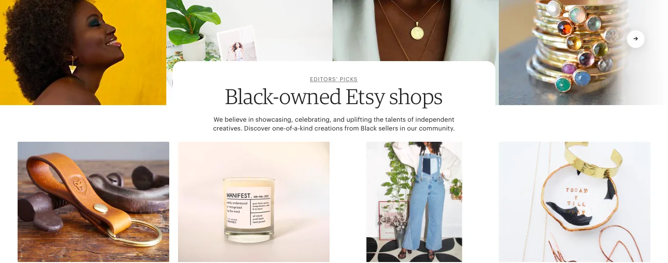
An editorial page with a main-page doorway
Curated picks could be blended into the personalized feed, given a separate editorial page, or made a filter on existing results. The main page drove revenue, and displacing personalized results with editorial ones put that at risk without an upside we could quantify in advance. I argued for blending and lost. Curated collections got their own editorial page, with a main-page banner as the doorway. That left shoppers to choose to visit, while a blended feed would have put curation where they already were and could have changed behaviour at scale. The banner was a weaker substitute for placement in the feed. The separate page shipped and converted; this project didn’t establish whether the blended version would have converted better.
What we shipped instead
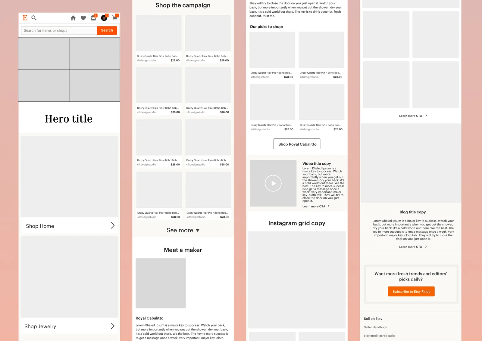
An editorial page for curated collections, a banner on the main page, and the merchandising tool behind both. We built it in stages: an algorithmic preview; filters that assembled a product mix from shopper behaviour; tagging and themes; then control over ordering.
The tool also supports audience segmentation and prevents someone in two campaigns from receiving duplicate emails.
The 20% conversion figure may mostly be a launch spike
The version I wanted put curated picks and personalized recommendations on the same surface, where shoppers already look. It didn’t ship. Displacing personalized results on the main page risked revenue, and my case for a blended feed wasn’t strong enough against a page already doing its job. We shipped the separate editorial page and its main-page banner.
The 20% conversion and 80% engagement figures came from two days immediately after launch. I don’t know whether they reflect the feature or the novelty of a new page on a site people visit often. I wouldn’t use those two days to decide that the blended version was the wrong bet.