Preqin~8 min read
An ESG score that meant nothing to the fund reading it.
Three versions of the module shipped. The two experiments after them both failed.
- Role: Product strategy, design, and research
- Timeline: 4 weeks
- Team: 1 PM, 1 engineer, me (plus investors and customer service)
- Impact: 7 contracts, ~$560k of contract value
- Platform: Web
What the modules returned
Contracts closed
~$560k of contract value the modules contributed to
Pre-sales calls
Engagement
Contracts and pre-sales calls are commercial outcomes the sales team can verify against its records, so they are the two figures here to weight most heavily, and they were counted over the two weeks after launch. The dollar figure is arithmetic, and it needs two caveats to be read correctly. Seven contracts at an institutional account value of about $80,000 comes to roughly $560k. That $80,000 is what accounts in the pilot group were worth, so it is a pilot figure rather than a list price, and a pilot group is not a random sample of the market. And the ESG modules contributed to that line item rather than constituting it: these are subscriptions the work helped close, not revenue the work generated on its own. Read $560k as the contract value this work contributed to, which is the honest ceiling on it. Separately, 80% of survey respondents marked the modules very helpful. That is self-reported and should be read that way. Engagement is the share of accounts where someone interacted with the benchmarks, measured across the whole account base rather than a subset, so the 60% is 60% of everyone on the product.
A number with no context
Preqin was opening a new product line — ESG data sold into private markets — and presenting it as a static snapshot. Two users could look at the same figure and neither could say what it meant for them, which is a hard thing to charge for. Limited partners were worried about greenwashing; general partners wanted to know what their peers disclosed.
That made the product problem and the commercial problem the same problem. An uninterpretable number cannot be demoed either, so a score nobody could read was as much a sales obstacle as a usability one, and the fix had to work in both conversations at once. The product had to put the number in context: this type of fund, this geography, these industries.
It took three versions of the module to get there, and each failed the same question in a different way — where do I look first. Version three shipped, alongside 7 contracts and 50+ pre-sales calls, roughly $560k of contract value the modules contributed to at the account values in the pilot group.
Then I tried twice to finish the job those modules opened. Both attempts failed, and why they failed is the most useful thing here — it turned out to be a limit on what this product was allowed to be, not a limit on how well I built it.
What I owned
I owned
- Product strategy, including the read that an uninterpretable score was a commercial problem before it was a usability one
- Three module versions and the reasoning behind each change
- Both follow-on experiments, the decision to build them, and the read on why they failed
- User research with both user types
- Components contributed back to the design system
Decided with others
- Feature sequencing, scored with the PM rather than set by me alone
- What the underlying ESG dataset could support, with engineering
The problem
Two user types, and neither could make sense of the score.
“I care about what this number means for this type of fund, in this geography, investing in these industries.”
The two user types are asking opposite questions — one is trying to catch a fund overstating itself, the other is trying to see how it compares — and it would have been easy to read that as two products. It isn’t. Both questions are unanswerable for the same reason and become answerable through the same mechanism: put the number against a relevant peer set and show which way it has been moving. Suspicion and benchmarking are the same operation pointed in different directions.
So the work wasn’t about surfacing more data. There was no missing data. It was about moving from a static snapshot to momentum over time and specific gaps against comparable funds.
From snapshot to momentum
What helps someone see where to look first?
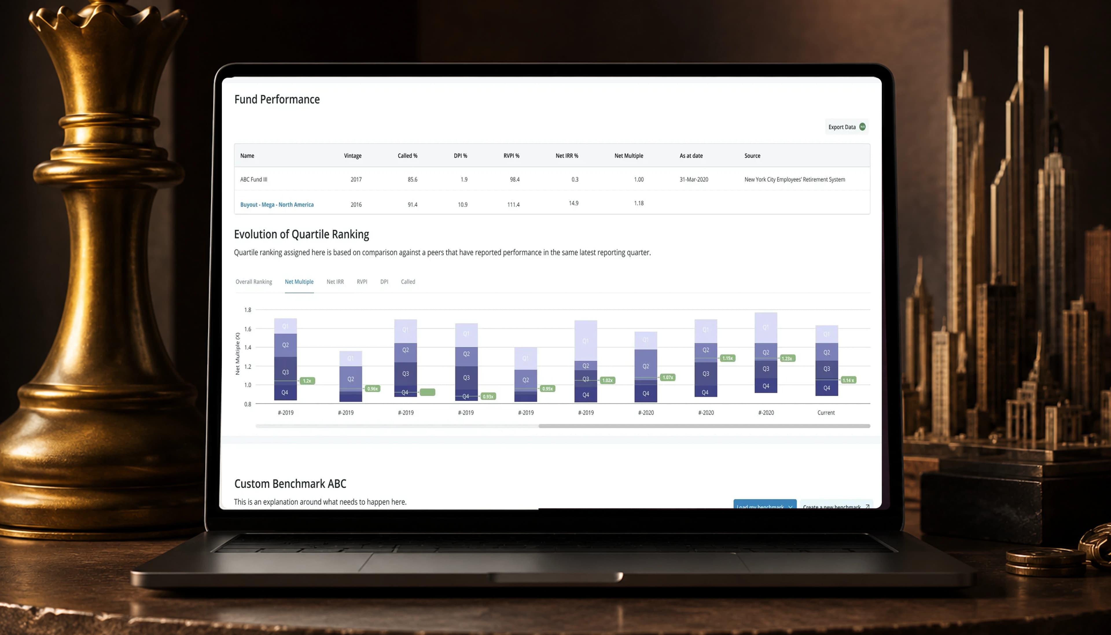
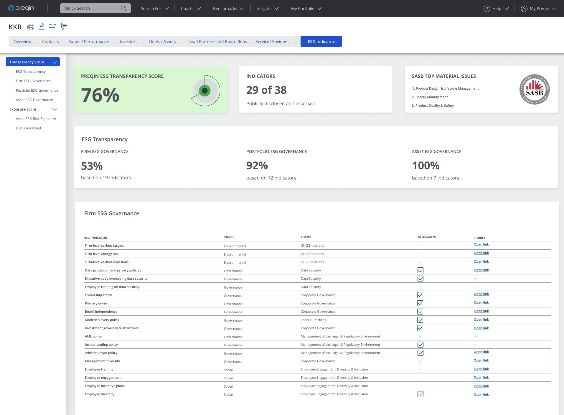
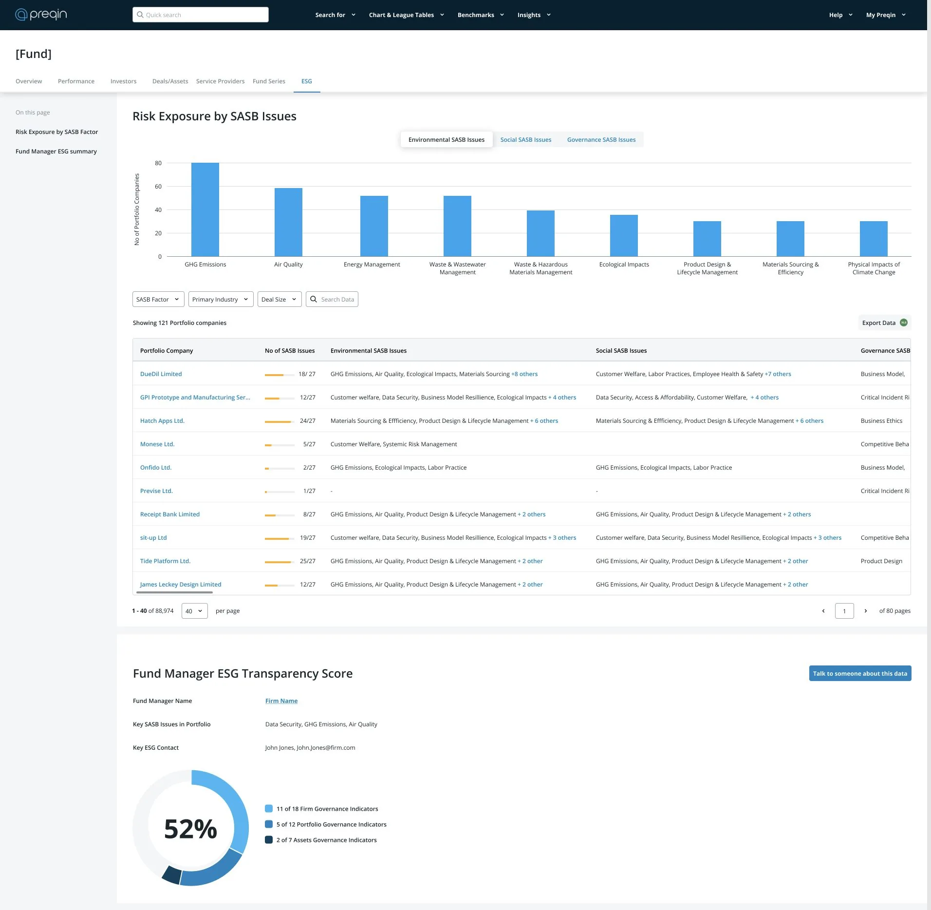
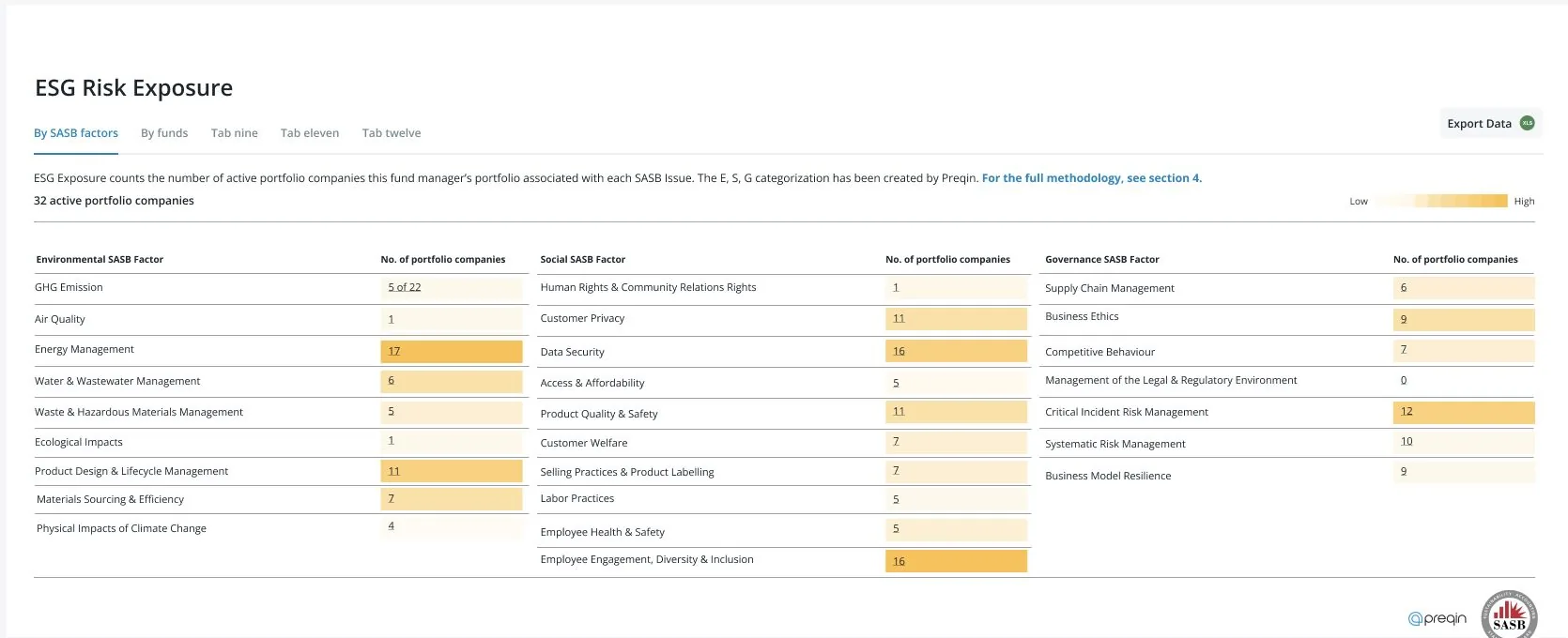
Three versions of the module went out: tables of exact values, then a multi-dimensional risk view, then heatmaps. Version one used tables, which worked for exact numbers and operational detail but not for deciding where to look first. Version two represented risk across its real dimensions but hid prioritization: everything was visible and nothing was ranked.
I used heatmaps to spot risk quickly. A heatmap shows where to look but not how much, and these users still need exact figures for diligence. The tables remained underneath so exact values stayed available. Version three shipped, and the commercial results are attached to it.
The modules opened a job they couldn’t finish
The product surfaced the data but did not finish the job.
Both follow-ons failed
Could the product help prepare for the meeting?
I could put a guided preparation drawer beside the data, build a wizard that walked through priority gaps and exported a brief, or leave the job to the user. Gap analysis identified what to ask about, then stopped; every investor rebuilt the same brief by hand outside the product.
I built both. The drawer put questions beside their gaps so users could assemble a brief without leaving the ESG tab. The wizard surfaced priority gaps, made questions editable, and exported a PDF. Both moved the product from reporting into advising, making it different from the product customers bought, and neither mitigation worked. Both failed for the same reason. They challenged what the product was for. Limited partners wanted their own thinking confirmed, and handing them a finished brief took away the part they were paying for.
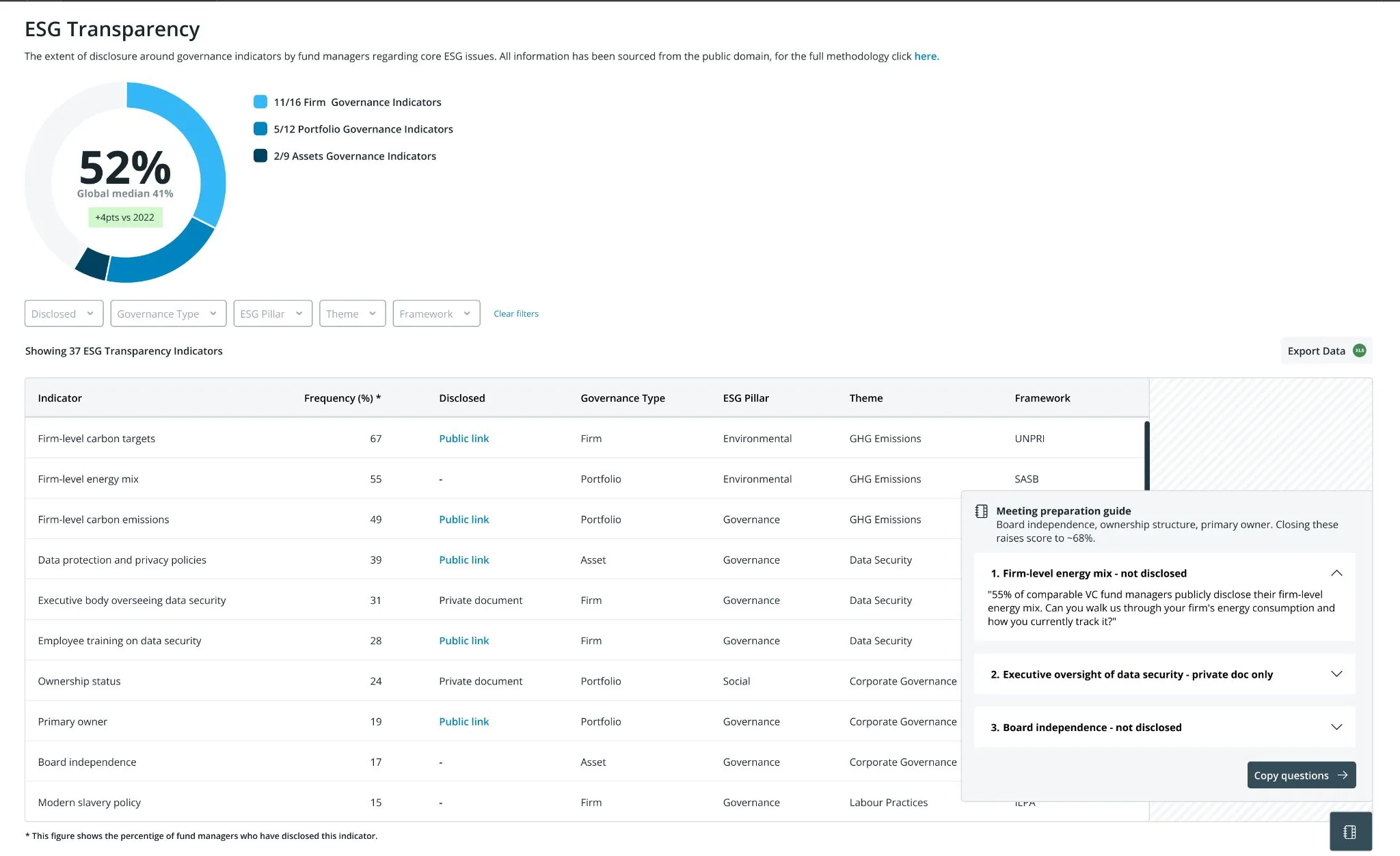
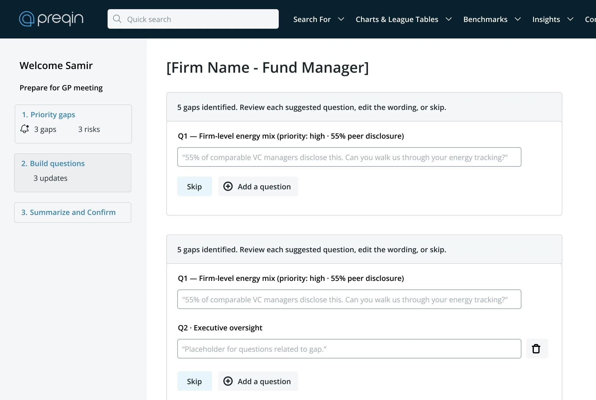
That was the project’s most useful finding, and it doesn’t show up in the results. A data product can credibly identify a gap and lose that credibility when it tells users what to ask about it. Identifying a gap is evidence. Recommending questions is advice. These customers were buying something to check their reasoning against, not advice.
The constraint it bought
The commercial result is the visible outcome and the boundary is the durable one. The company came out of this knowing something about its own product line that it did not know going in: these customers will buy evidence and will not buy advice, and the wall between the two sits somewhere before a prepared list of questions. That is a positioning constraint on everything the data business might build next, and it cost two prototypes rather than a launch to find.
The three-version sequence produced a smaller reusable result. Tables, then a multi-dimensional risk view, then heatmaps over the tables — that is one question asked three times, and the version that won kept the losers underneath rather than replacing them. Exact figures stayed available beneath the shading because diligence still needs them.
Components from the modules went back into the design system, which is the least interesting thing here and the one most likely to still be in use.
Right method, wrong question
Both follow-ons tested well as interfaces. They failed as claims about what the product was.
Neither the drawer nor the wizard failed on usability. People could operate both. What they rejected was the proposition underneath — a tool that had been checking their reasoning was now doing the reasoning, and the part it took over was the part they believed they were paying for.
That class of risk is invisible to the testing I was doing. A usability session asks whether someone can complete the task, and both prototypes passed; nothing in that method asks whether they want the task done for them. I ran the right method against the wrong question, twice.
What I do differently since: when a feature extends what a product is for rather than how well it does it, I test the positioning claim before building the interface — describe the changed product and ask what they would stop doing themselves. That is a cheaper experiment than either of the two I ran, and it is the one that would have found this. The note below is about the thing I still don’t know, which is where exactly the line falls.
The finding was right. Both answers were wrong.
Investors had a real gap, and both products built to fill it failed. The drawer and wizard answered the same finding. Investors identified a gap in the product, then went elsewhere to turn it into questions.
The problem was not execution. Both crossed a line customers had drawn, without saying so, between a product that shows where to look and one that tells them what to think. I know two points on the wrong side of that line, but not exactly where it sits.
Nobody revisited this while I was there, so gap analysis still identifies work it leaves the user to finish. Somewhere between showing evidence and giving advice there is a line customers won’t let a data product cross, and I never found where it sits.